¶ Organisation overview
When you open the "Consumption overview" dashboard, you will see a list of all your organisations. The period selection on the top right is applied to the entire dashboard. You can click on a row to open an organisation.

By clicking on the period selection at the top right you can select a different period, which will be applied to the entire dashboard. This can be done via the following popup.
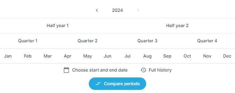
The "Choose start and end date" option allows you to select a custom period.
The option "Full history" ensures that all historical data is shown.
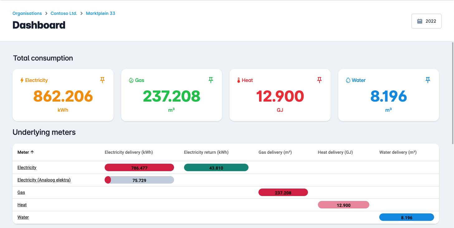
If you only have access to one organisation or have clicked on an organisation in the above list, you will see this complete overview. This contains all total consumption of the various products, such as electricity, gas, heat and water. Below that is a list of underlying buildings.
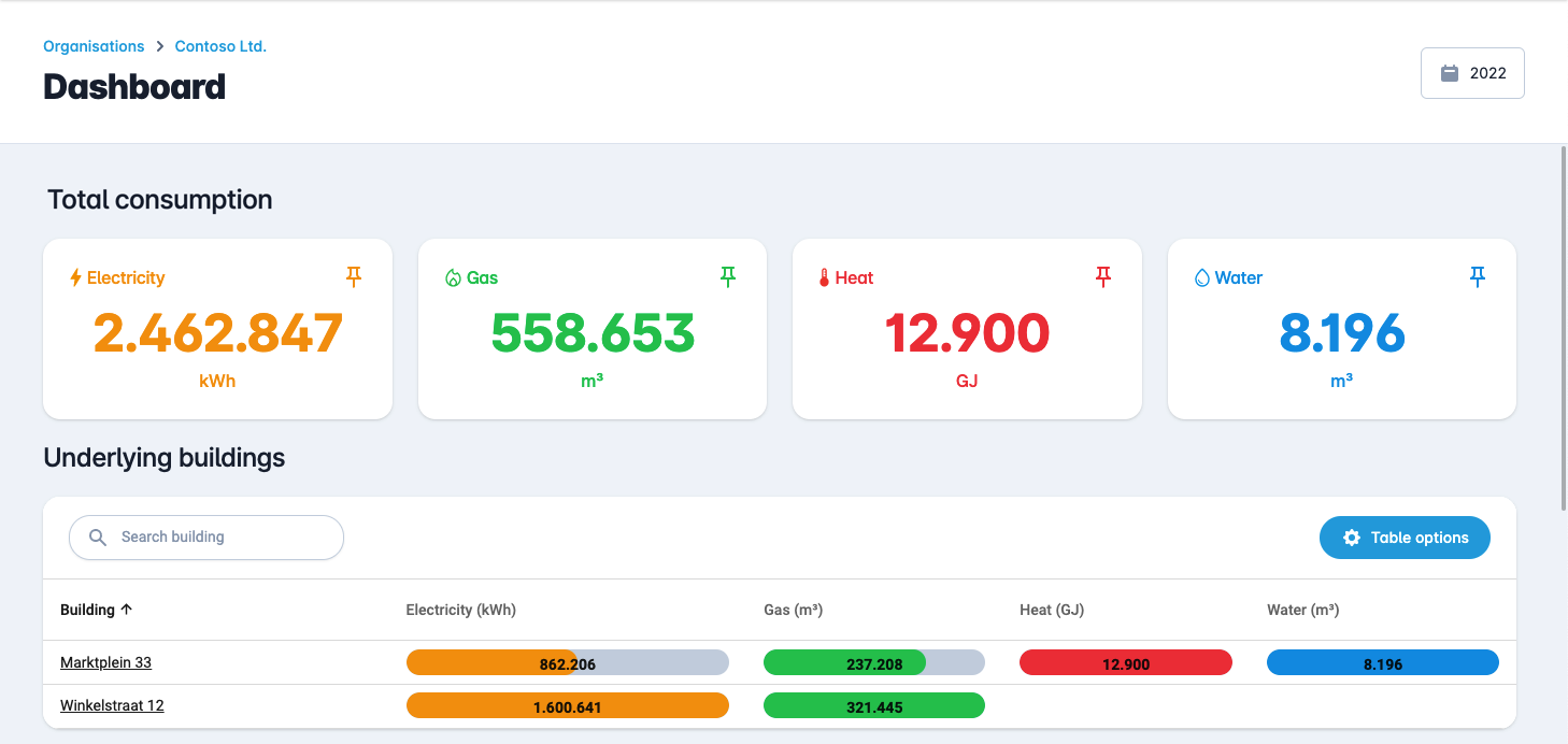
By clicking on a row of a building, you open the buildings dashboard and you can see the meters below.
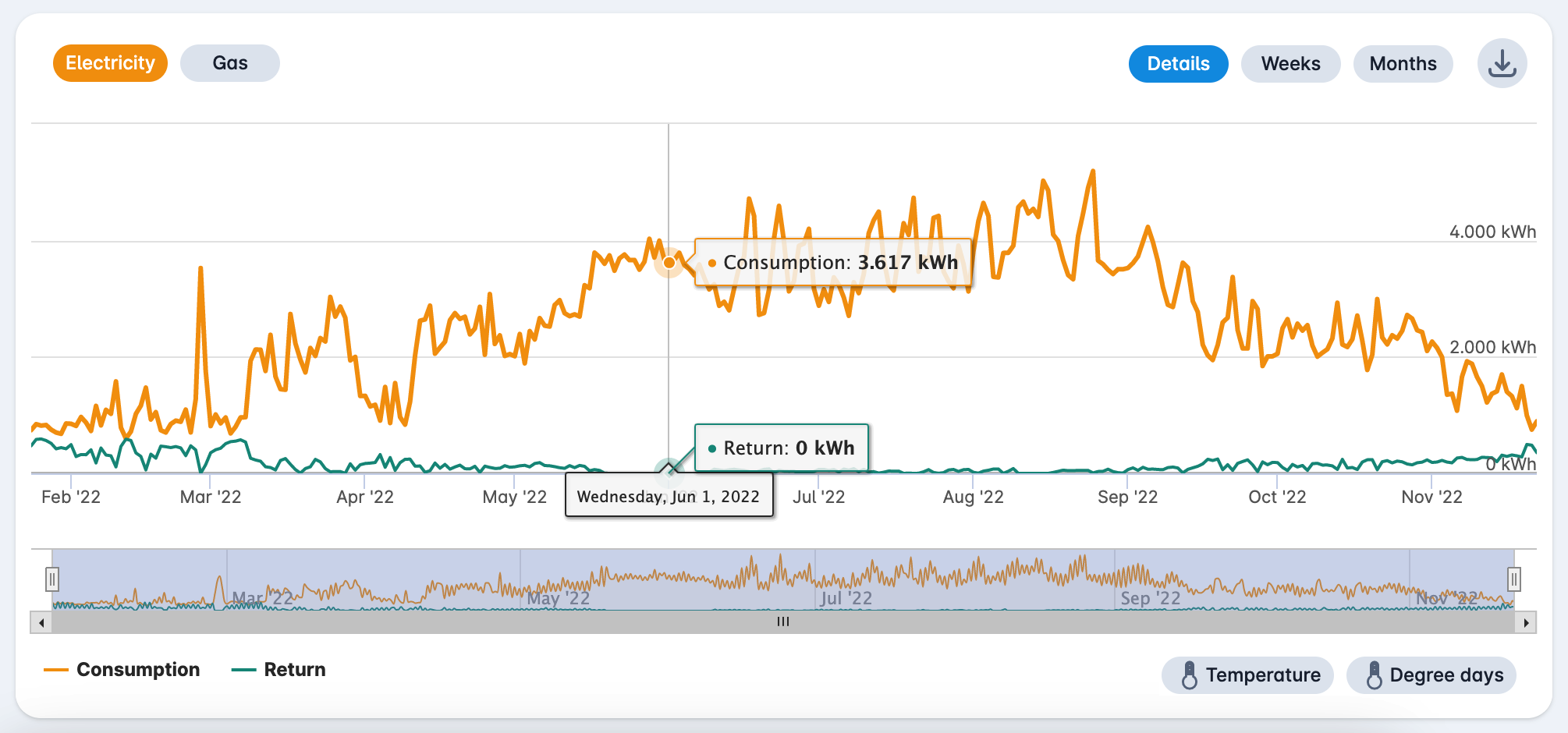
¶ Net consumption - electricity
If you scroll down you will see the consumption per month.
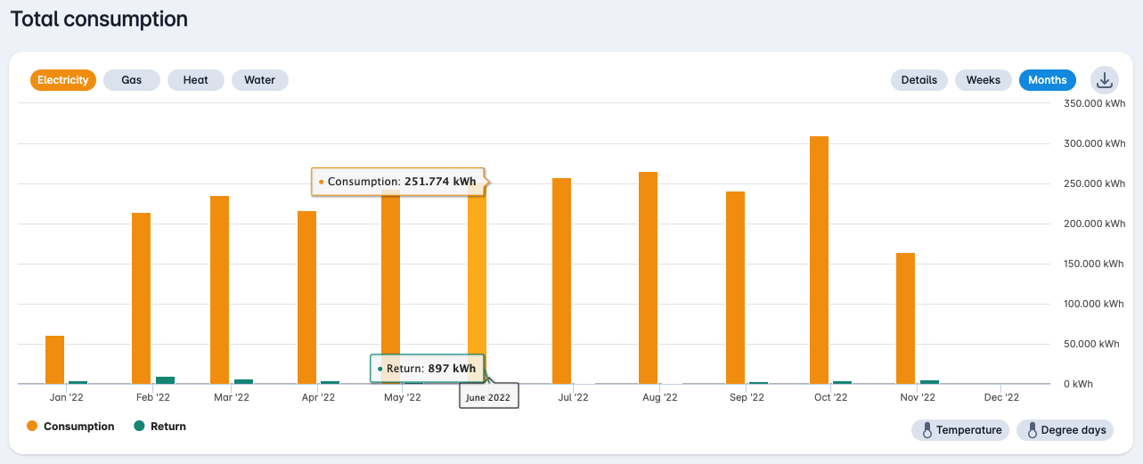
At the top right of the graph you can click on the download icon to download an Excel (.xlsx), a CSV file or a PNG image of the graph.

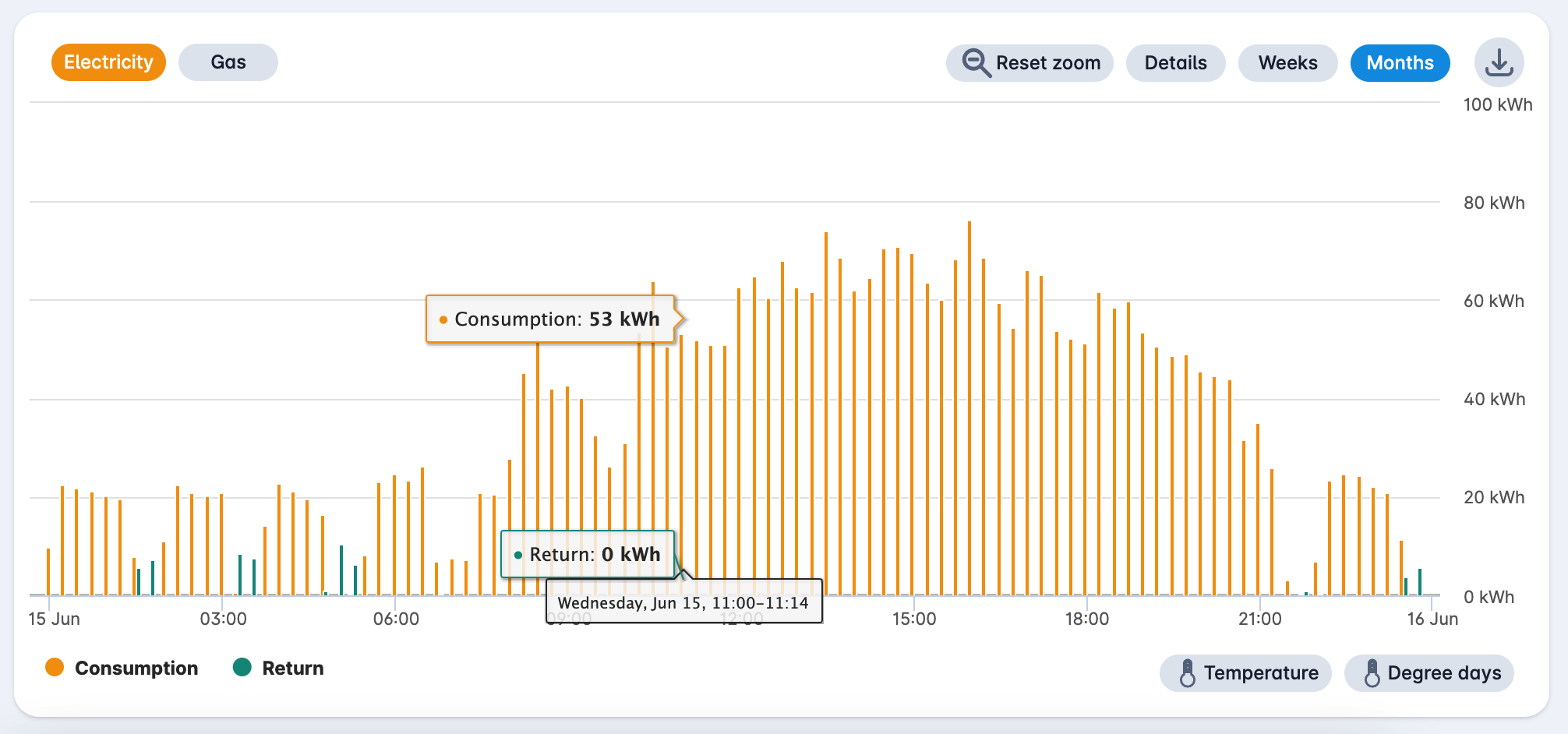
By clicking on the bar in the diagram you can zoom in to the daily consumption.
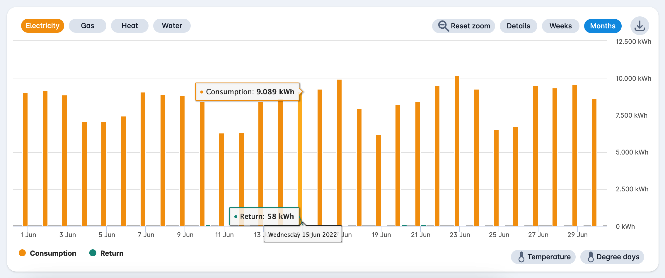
By clicking on the bar in the diagram again, you can zoom in to the quarter-hourly or hourly consumption, if this data is available. With the "Reset zoom" button you return to the consumption per month.
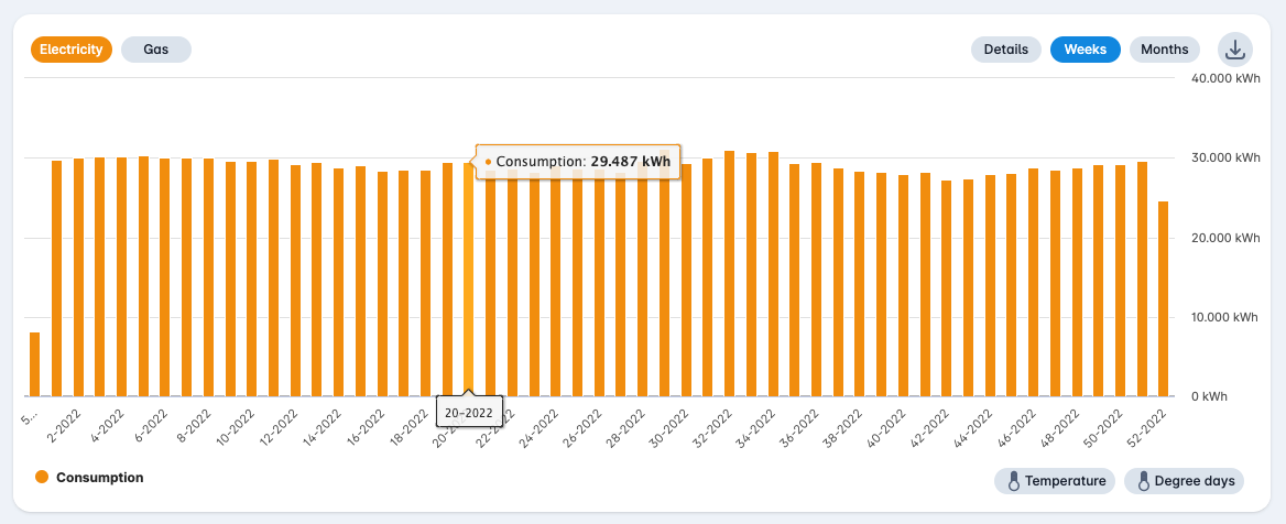
With the button "Weeks" at the top right you can see the consumption per week.
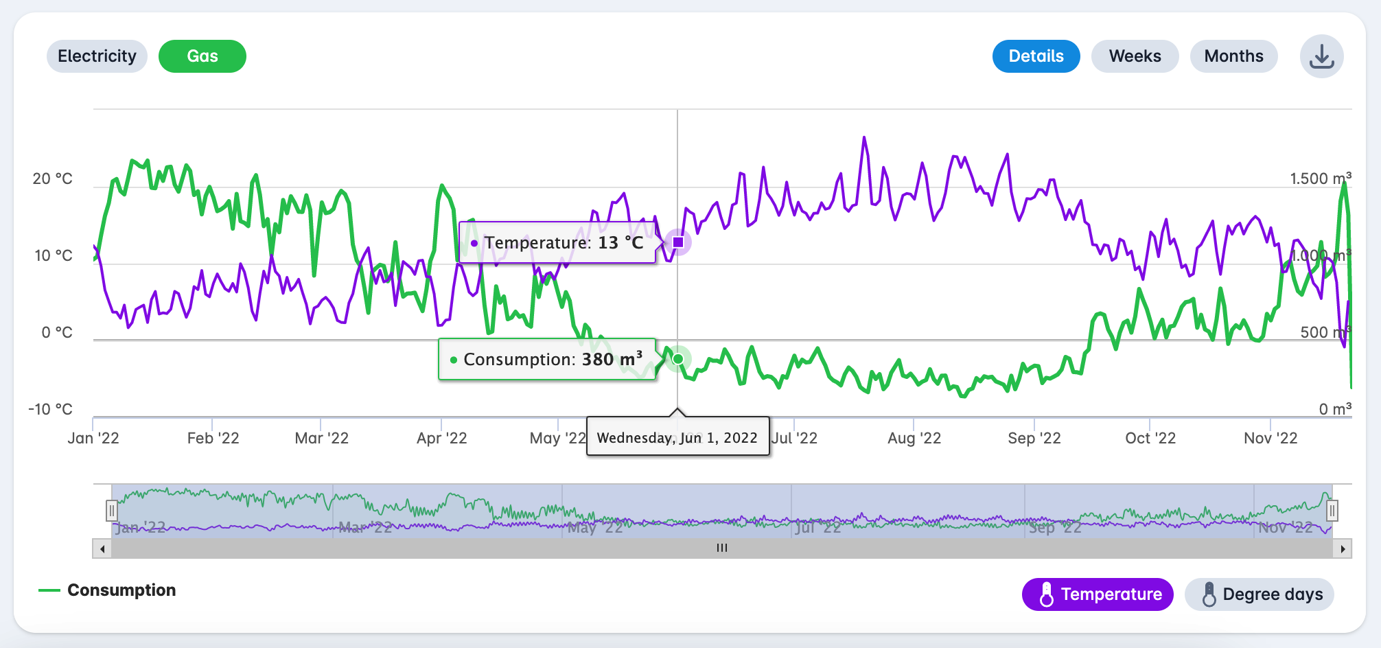
With the button "Details" at the top right you can see the consumption as a line chart. You can zoom in and out and scroll through a specific period via the bar below the graph.
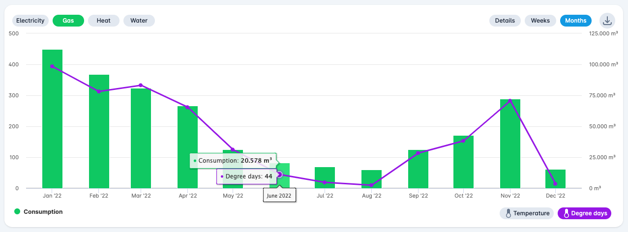
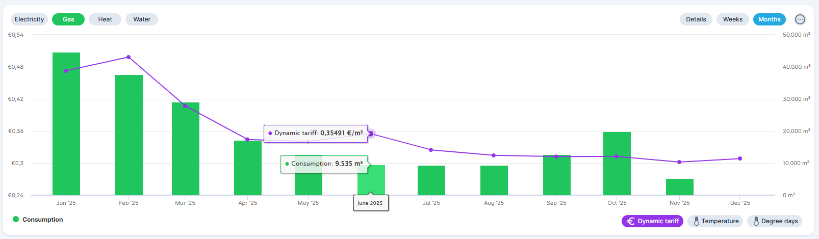
¶ Net consumption - gas
With the buttons at the top left you can switch to different products, such as electricity, gas, heat and water. With the "Temperature" button at the bottom right you can switch the average temperature on or off.
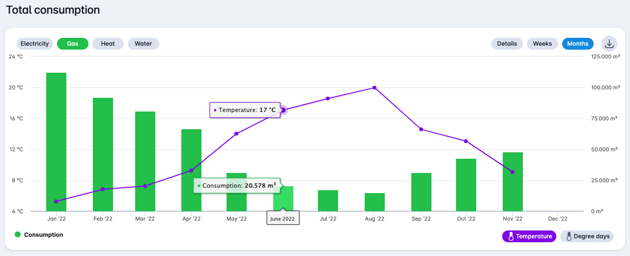
With the button "Degree days" at the bottom right you can switch the degree days on or off.
With the button "Dynamic tariff" at the bottom right you can switch the average dynamic tariffs on or off.
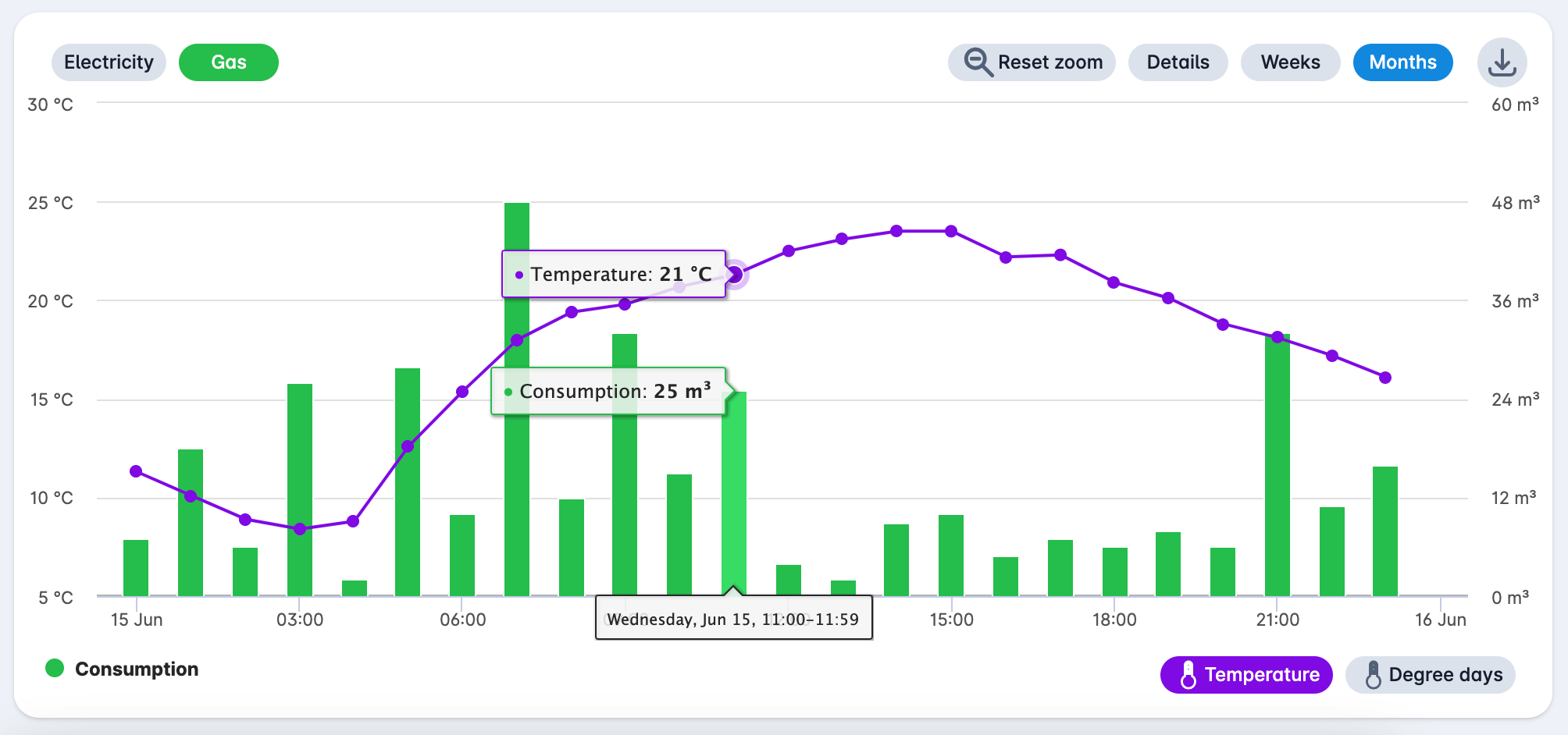
By clicking on the bar in the diagram you can zoom in to the daily consumption.
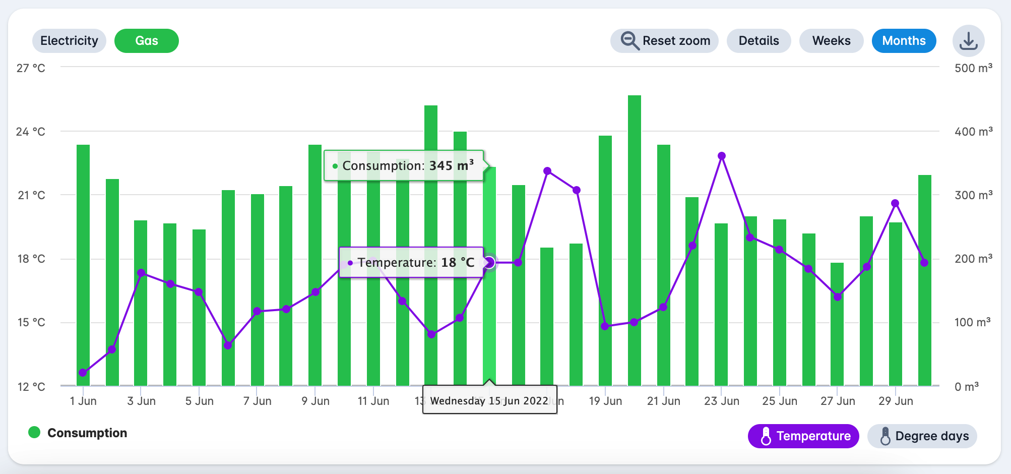
By clicking again on the bar in the diagram you can zoom in to the quarter-hourly or hourly consumption, if this data is available. With the "Reset zoom" button you return to the consumption per month.
With the button "Details" at the top right you can see the consumption as a line chart. You can zoom in and out on a specific period via the bar below the graph.
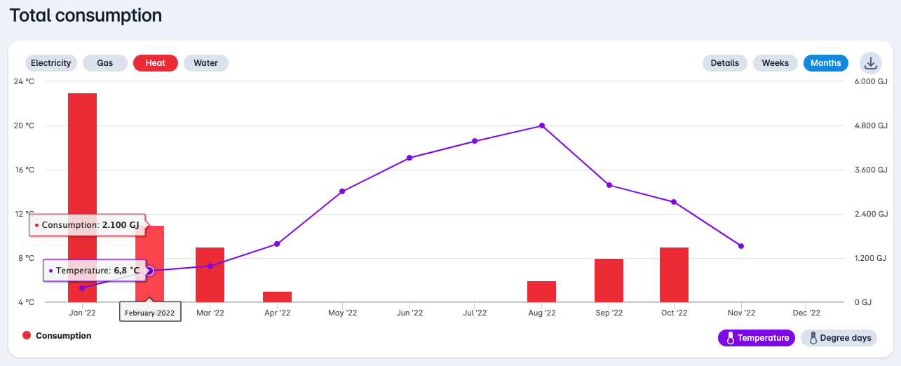
¶ Net consumption - heat
You can display the consumption by clicking on the "Heat" button at the top left.
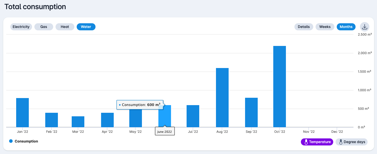
¶ Net consumption - water
You can show the consumption by clicking on the "Water" button at the top left.
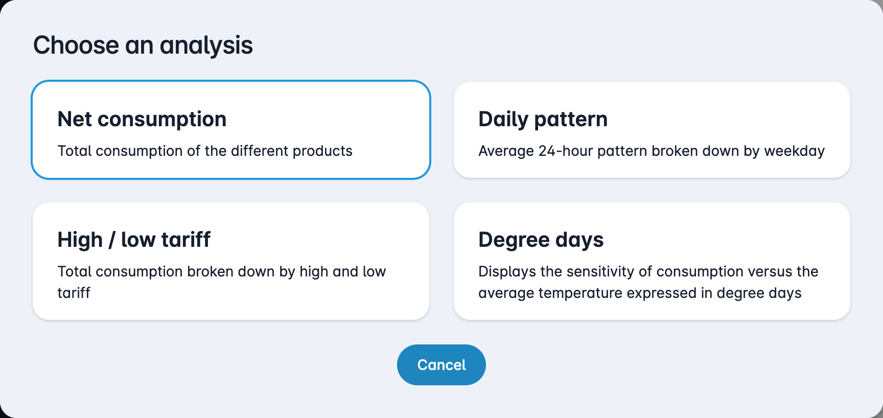
¶ Other analyses
If you press the button "Analysis" you can open other analyses.

You can then choose this in the popup that opens.
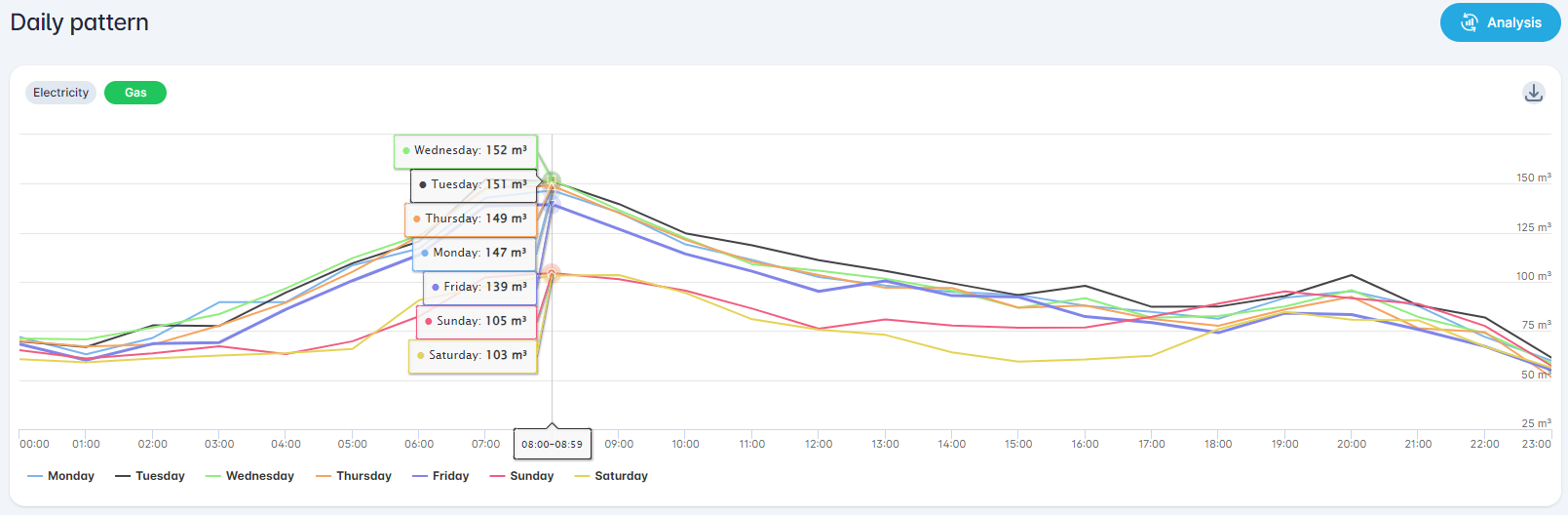
¶ Daily pattern
This analysis shows the daily pattern of the average 24-hour pattern broken down by weekday.
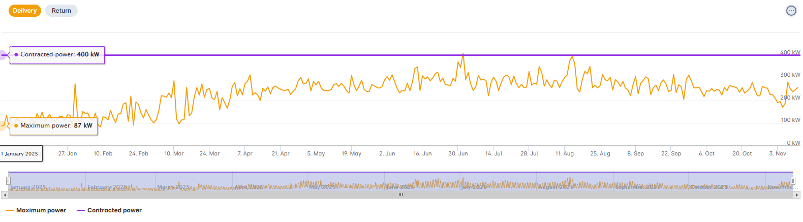
¶ Contracted power
This analysis compares maximum peak power to contracted power.
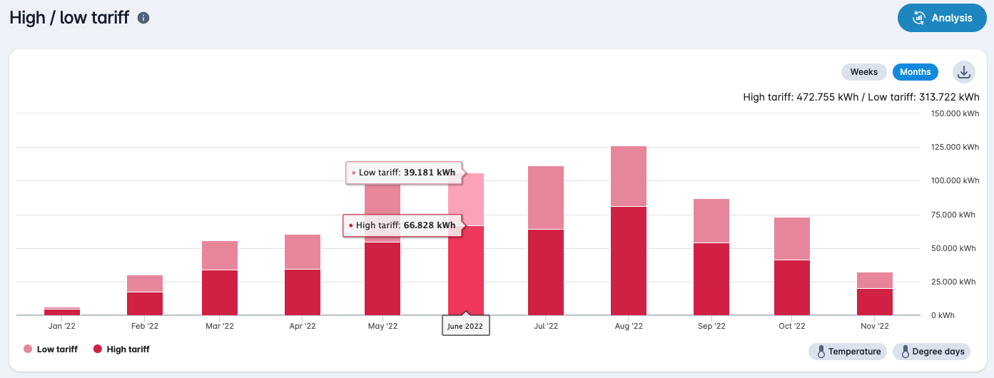
¶ High / low tariff
This analysis shows the total consumption divided into high and low rates.
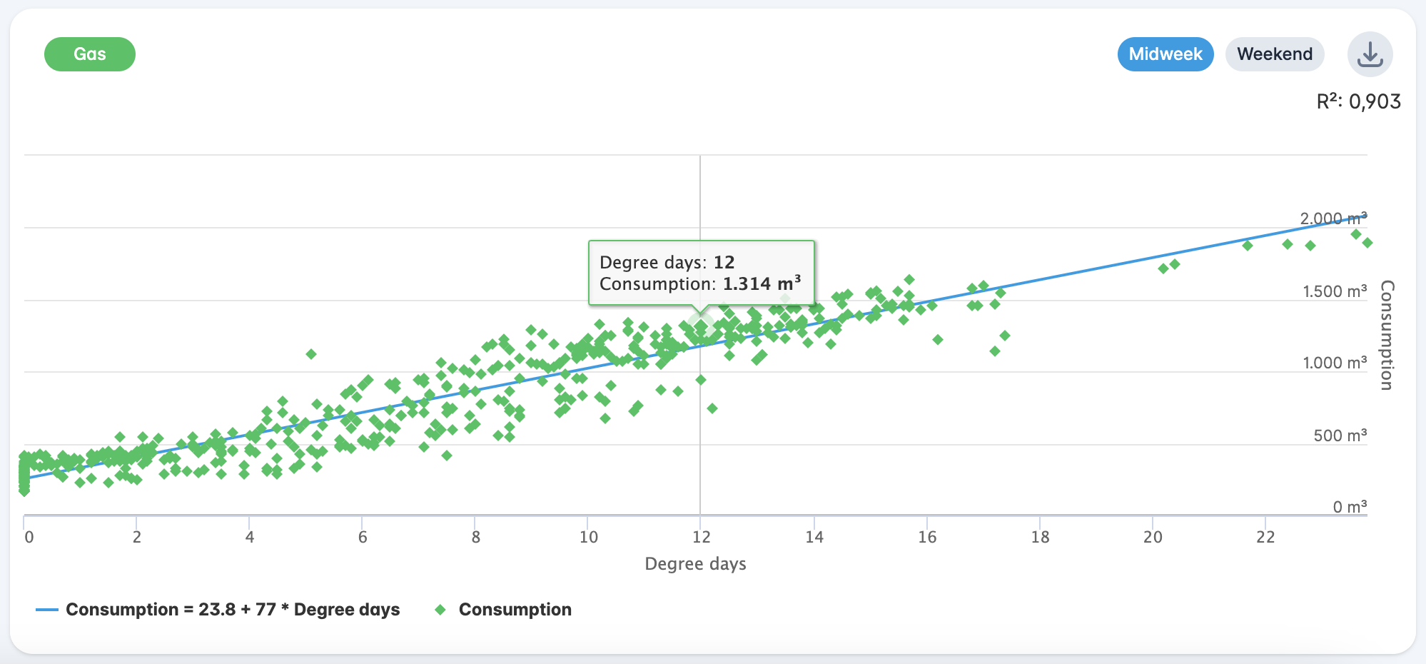
¶ Degree days
This analysis shows the sensitivity of consumption in relation to the average temperature expressed in degree days.
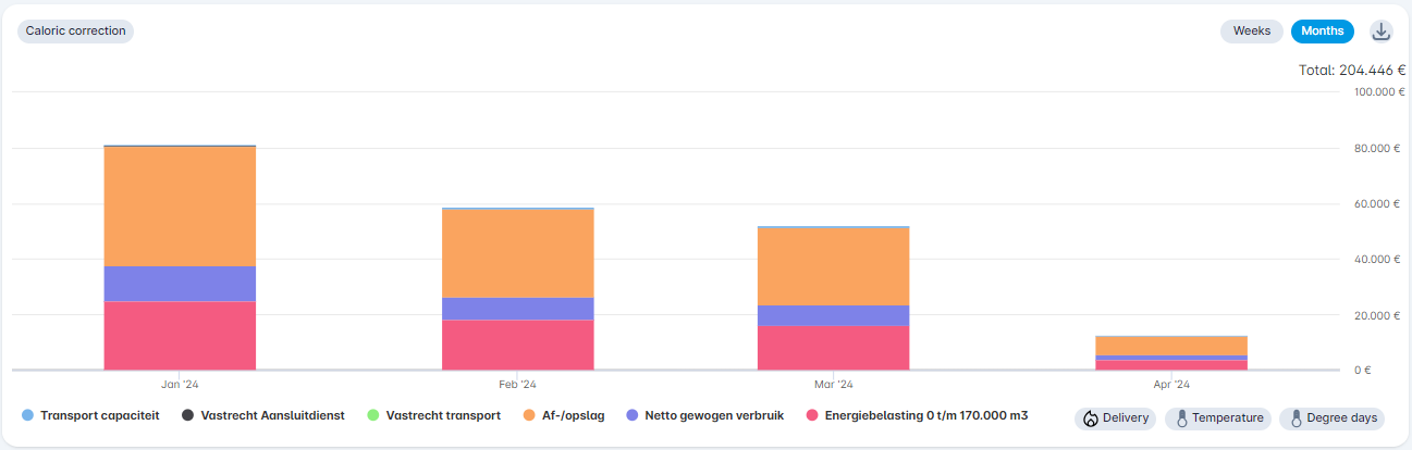
¶ Cost structure
This analysis shows the cost structure of the meter. This analysis is only available at meter level. At the bottom of the graph it is also possible to display the [Consumption] series with which the costs were calculated. For gas, this consumption will differ from the total consumption, because this shows the consumption in gas days (consumption from 06:00 to 06:00).
For the cost analysis for gas, the [Caloric correction] button appears at the top left, which will correct the gas consumption (and therefore also the costs) using the caloric values. These calorific values are updated after every 7th working day of the month with the values on mijnenergiedata.nl.
¶ CO₂
This analysis shows the CO₂ emissions of this meter. This analysis is only available at meter level.
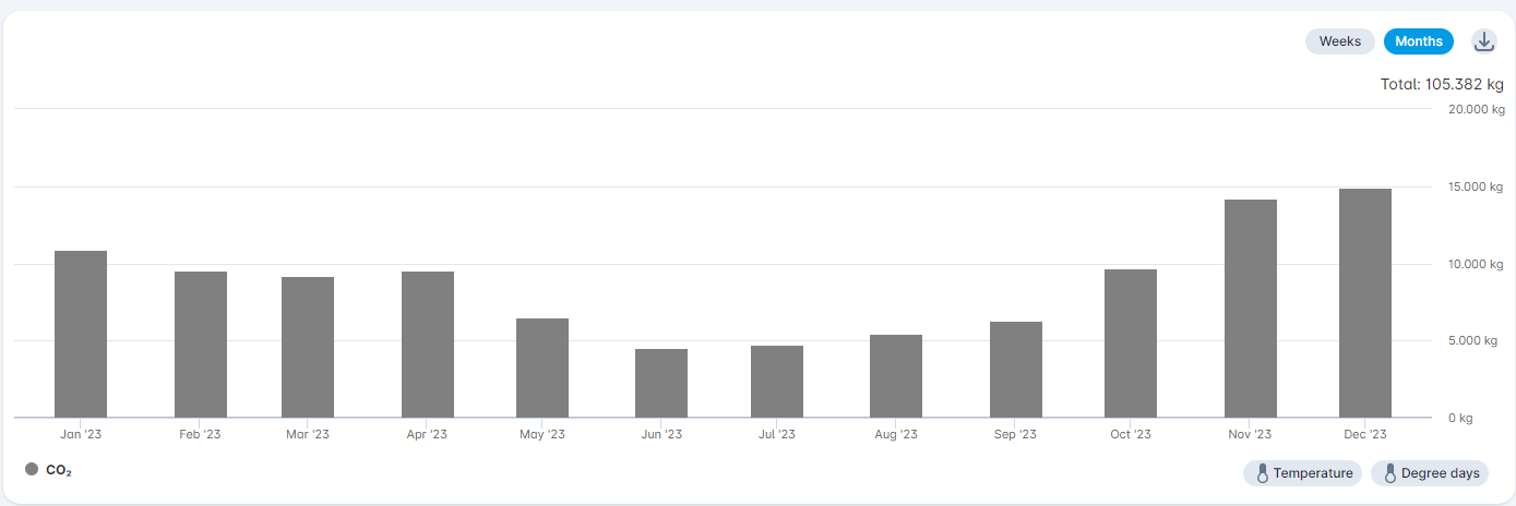
We use the annual co₂ emission factors for gray electricity and natural gas ("aardgas") to calculate emissions.
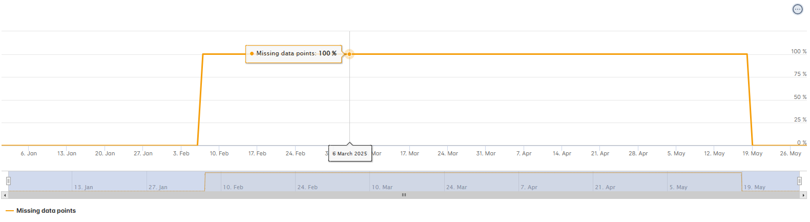
¶ Missing data points
This analysis shows the missing data points as a percentage. This analysis is available at the meter level.
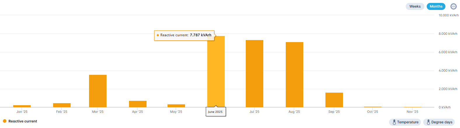
¶ Reactive current
This analysis shows reactive current. This analysis is available for electricity at the meter level.
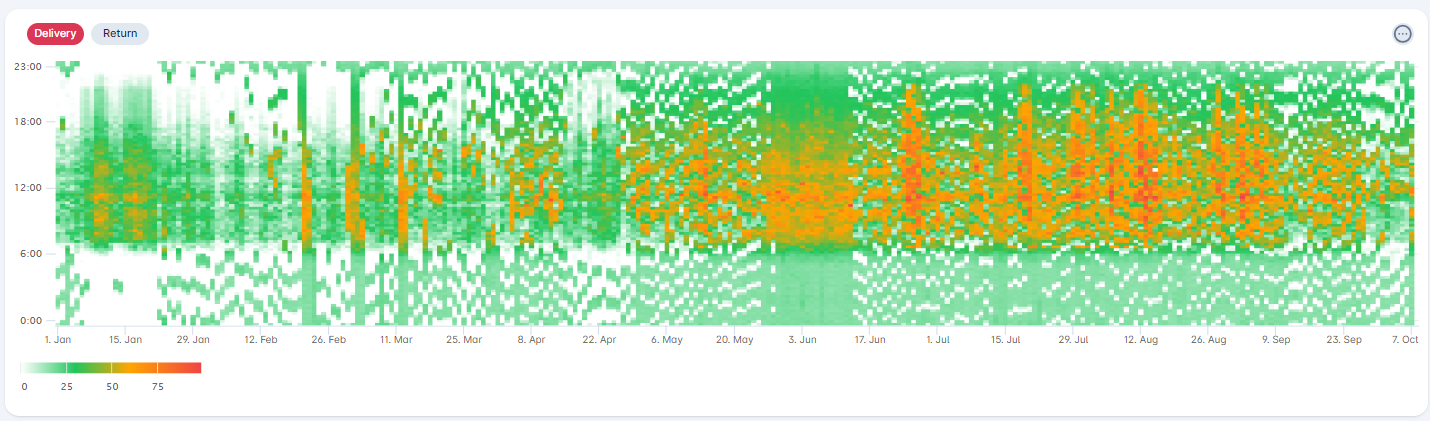
¶ Color plot
This analysis shows the color plot analysis. This analysis is available at every level.
¶ Dynamic tariffs
The dynamic gas and electricity tariffs can be displayed in the different graphs. To view the dynamic rates, simply click on [Dynamic tariff] below the graph. The dynamic tariffs are the Day Ahead prices and are updated daily.
Our dynamic electricity tariffs come from ENTSO-E, which in turn obtains them from EPEX SPOT. The dynamic gas tariffs are provided by the EEX.
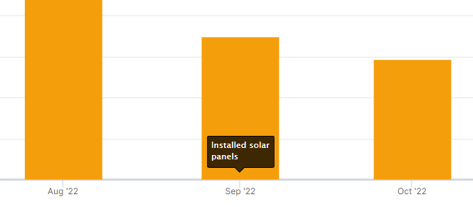
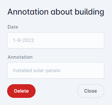
¶ Annotations
It is possible to show annotations about the building in the analyses. For example to indicate the installation of solar panels or when insulation was improved. Annotations can be added via the menu at the top right of the graph. It is also possible to hide or show the annotations.
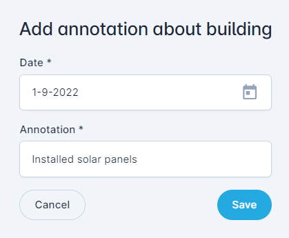
Annotations will be shown in both the building chart as the charts of the underlying devices.
The annotation can be dragged to any place within a chart. Please note: This position will not be saved!
When clicking the annotation, both the date and the full annotation will be shown. It is also possible to delete the annotation in this view.
Annotations will also be shown when comparing periods. To indicate the year the annotations concerns, the annotation will be shown at either one of the columns or the annotation message is prefixed with the year.
¶ Forecasting
The forecasting functionality provides a projection of the expected consumption at meter level for the remaining months of the calendar year. The prediction is based on historical consumption data in combination with machine learning. Once the new grid operator tariffs become available, the forecast is automatically extended to include the following calendar year.
The model detects trends in energy consumption, such as seasonal effects and other recurring patterns. For forecasting, we use up to five years of historical data to identify both annual and weekly patterns. The annual pattern is derived from daily values and accounts for seasonal influences, while the weekly and daily patterns are determined using more detailed consumption data (hourly/quarter-hourly).
The prediction itself is made using SSA forecasting (Singular Spectrum Analysis). This model filters noise from the data, meaning that unexpected fluctuations statistically considered random behavior are not included in the forecast. In addition, negative values are adjusted to zero, and unrealistic or inconsistent weekly patterns are replaced with historical averages.
Forecasting is only available within the consumption overview at the meter level. When the functionality is enabled, an additional selection option appears under the Analysis button. Here, you can choose from the following views:
- Total Consumption: forecast of the expected volume per product (electricity, gas, water, heat)
- Cost Module: estimation of total costs, based on entered contract rates
- High/Low Tariff: breakdown of consumption by day and night tariff (if applicable)
The forecasting module provides users with a reliable tool to estimate future consumption and cost developments, thus supporting more informed decisions within energy management.
Some points of attention:
- At least two years of data must be available to determine a trend. As a result, no forecasting will be available for meters with less than two years of data.
- Extreme deviations in consumption in recent months can distort the trend and can even lead to extreme predictions.
- The forecast is recalculated every weekend.
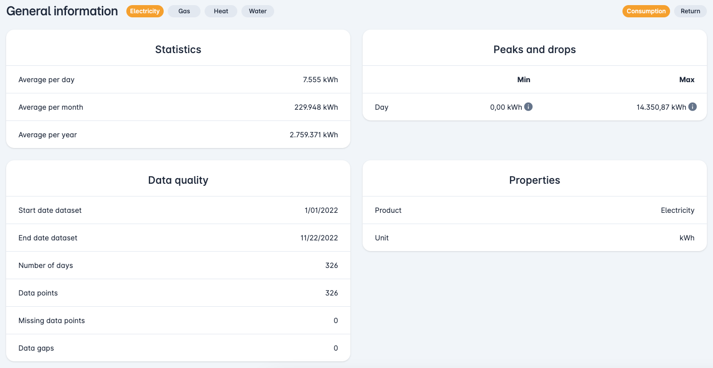
¶ General information
Below the graph general data is shown, such as "Statistics", "Peaks and drops", "Data quality" and "Properties".