¶ Filters
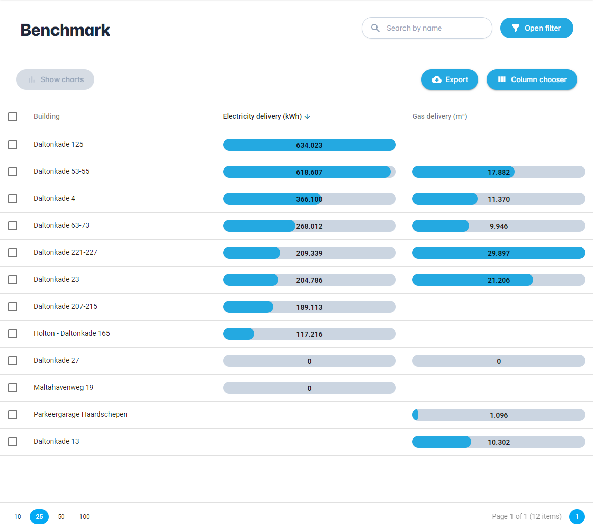
If you click on "Benchmark" in the left menu bar, you will open the Benchmark dashboard. This is a powerful tool that you can use to compare different types of consumption and perform comprehensive analysis of your building and/or meter portfolio.
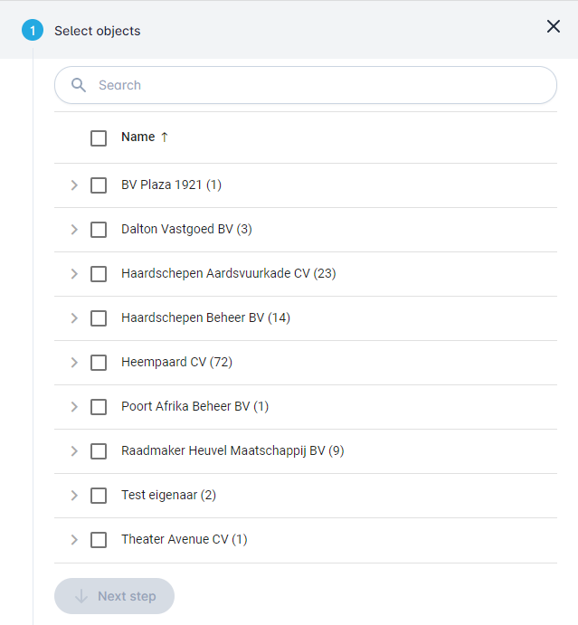
When you open the page the filter sidebar is automatically opened and you can select one or more objects that you want to benchmark.
When you click on the "Next step" button you can choose the benchmark options.
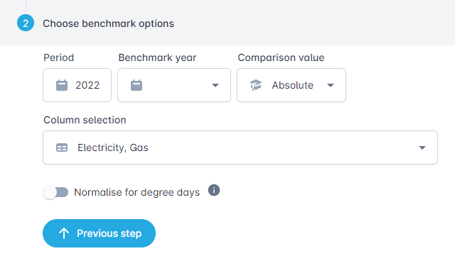
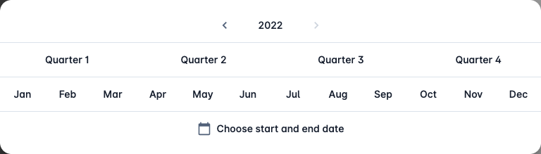
The "Period" field allows you to choose time period on which to benchmark.
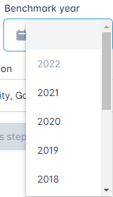
The "Benchmark year" allows you to compare the selected time period with the same time period of another year.
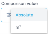
The "Comparison value" is used to choose between an absolute and a relative benchmark. In case of a relative benchmark, you can select which parameter to use like surface in m².
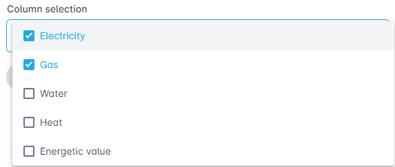
The "Column selection" allows you to choose the columns that are calculated and shown. Here you can enable "Energetic value" in kWh, which is useful if you want to compare different types of energy with eachother.
The slide toggle "Normalise for degree days" allows you to normalise the measurement data based on the calculated average temperature of the last 5 years.

¶ Absolute benchmark
When you perform an absolute benchmark, all the absolute consumption numbers will be shown and compared.
¶ Table options
Export
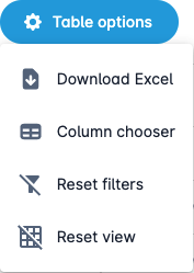
The "Export" button allows you to export all the visible columns and rows in the table as an Excel file (.xlsx). This file will automatically be downloaded to your device.
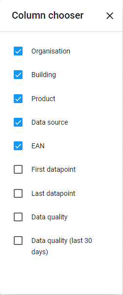
Column chooser
You can use the "Column chooser" to turn on or off certain columns, so that the table becomes more readable.
Reset filters
The "Reset filters" button disables all filters.
Reset view
The "Reset view" button resets the view to the default view.
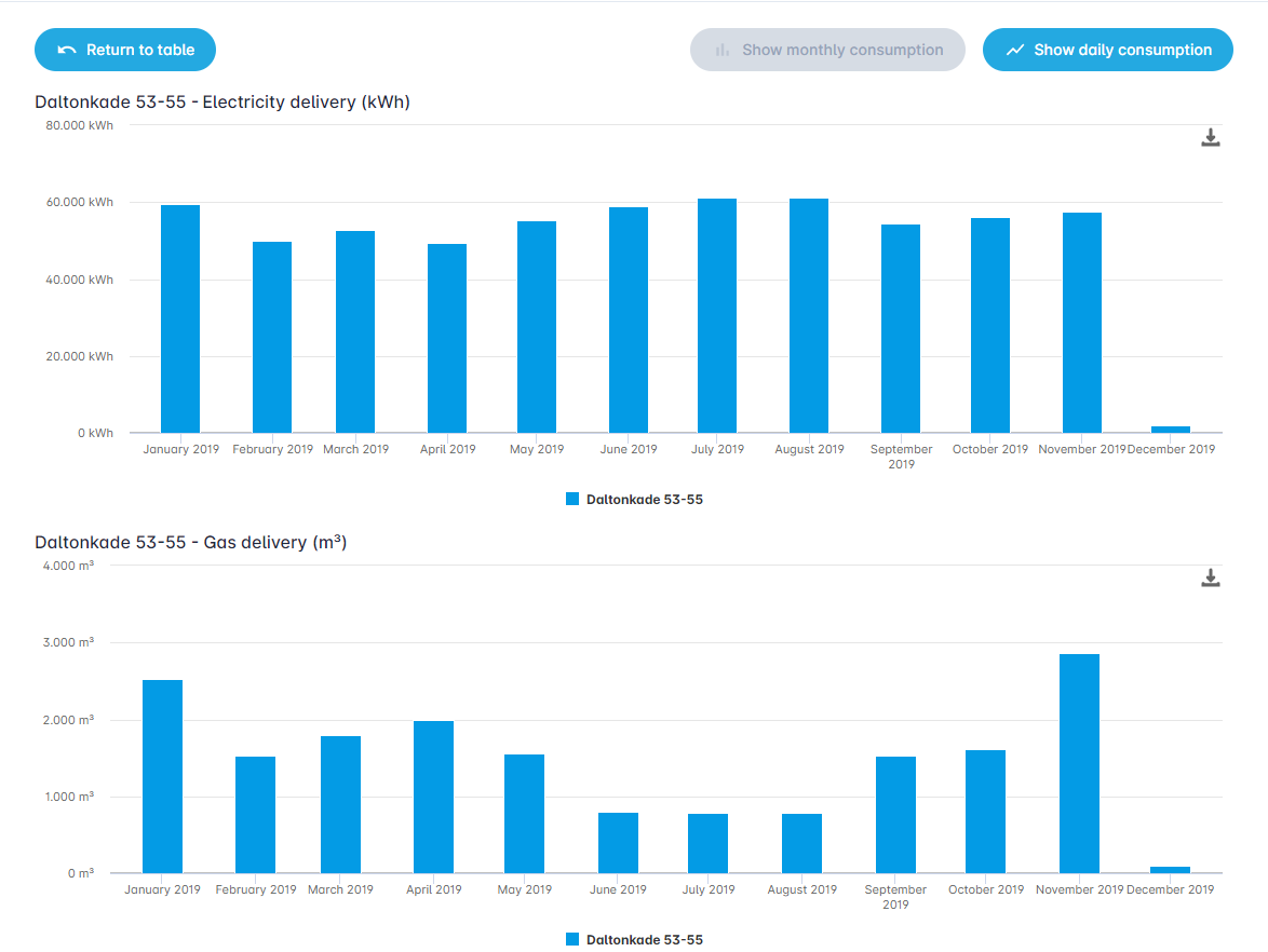
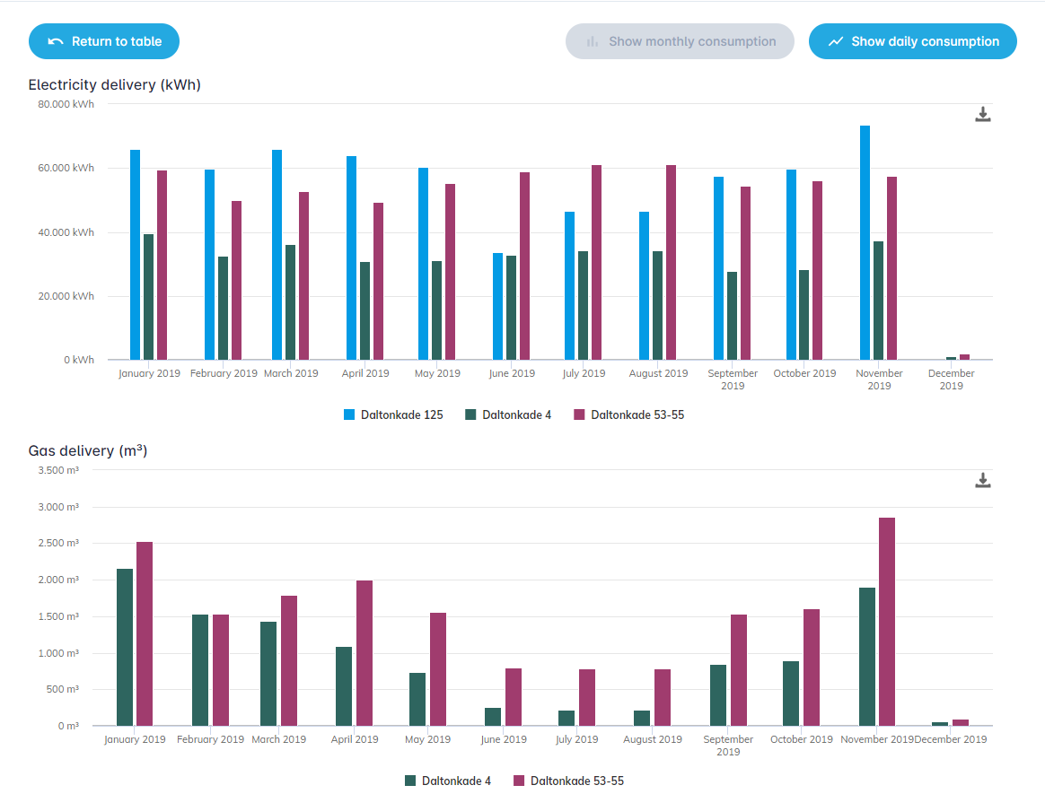
You can select one or more buildings to show the a bar chart with the consumption. This can be done with the "Show charts" button.

When you select a single building and press the button you see the following bar chart below.
When you select a multiple buildings you can easily compare their consumption, as shown below.
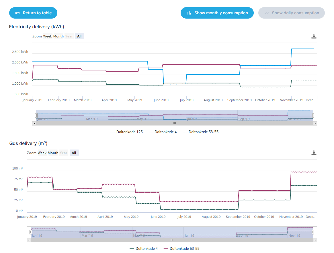
You can also show a line chart of the daily consumption to analyse the data in more detail. This can be done with the "Show daily consumption" button.

This will show the line chart as shown below.
When you click on the "Show monthly consumption" button, you go back to the previous bar chart.

When you click on the "Return to table" button, you go back to the starting benchmark table.

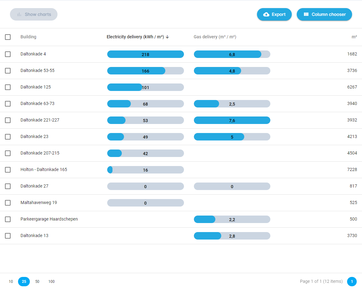
¶ Relative benchmark
When you perform a relative benchmark, all the consumption numbers will be shown relative to a certain parameter like surface in m². This will only work if you have input this paramater for the selected buildings.
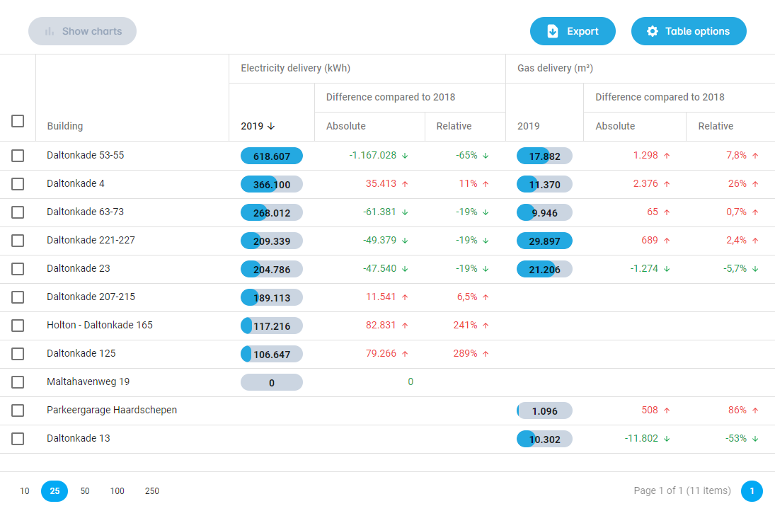
¶ Time period comparisson
When you choose a "Benchmark year", you can compare two time periods with eachother. In the table shown below you can see the consumption of the time period and the increase or decrease in the benchmark year. All increases are shown in red and decreases in green.
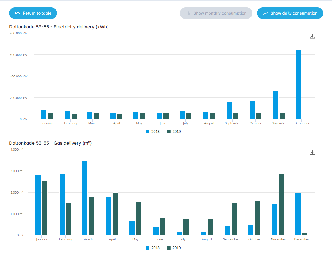
When you click on the button "Show charts", you can see the two time periods in a bar chart for comparisson.
This will show the bar chart below.
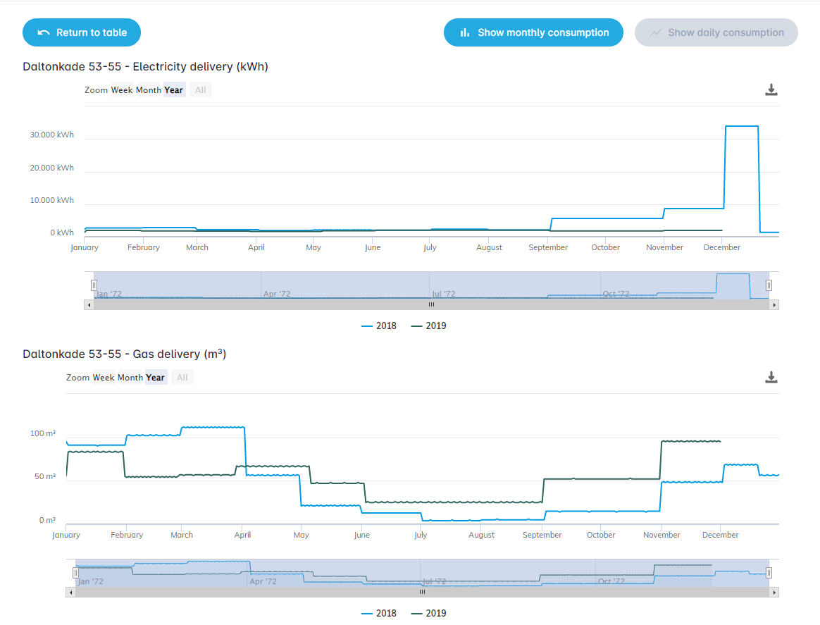
When you click on "Show daily consumption", the consumption of both periods is shown in a line chart.
This will show the line chart below.
When you click on the "Return to table" button, you go back to the starting benchmark table.